Goals & Objectives
- Organize a large amount of content in a small space
- Create layouts that are visually easier to follow
- Downsize the print surface to be easier to hold
- Maintain brand standards while changing the overall design
Step 1
Reorganize & reformat existing content
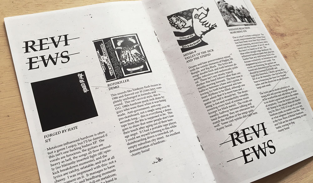
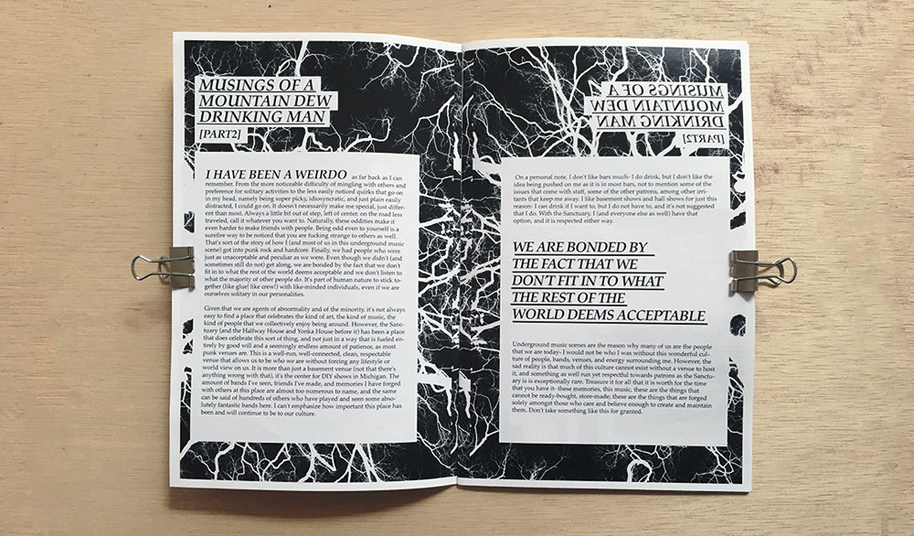
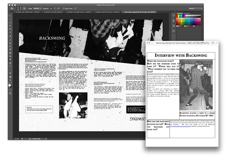
One of the project’s biggest challenges was to address the old design’s use of space. Even on a larger print surface, the original design was cluttered, busy, and hard to navigate. This issue needed to be solved while simultaneously working on a smaller surface. I addressed this by reworking the entire design and maximizing the available space. Pictured above, the final design and the inset original on the lower right.
Creating space
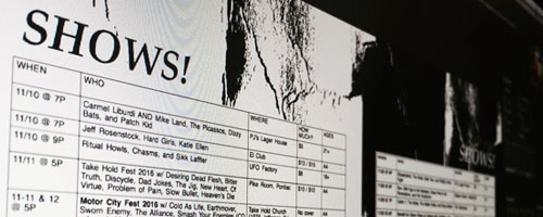
The former design was wasting so much space that the new design incorporated content not previously available, including a shows table and schedule that was legible and easy to tear out of the book.
Saving space
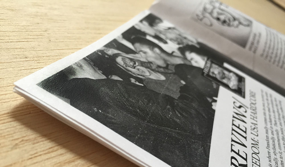
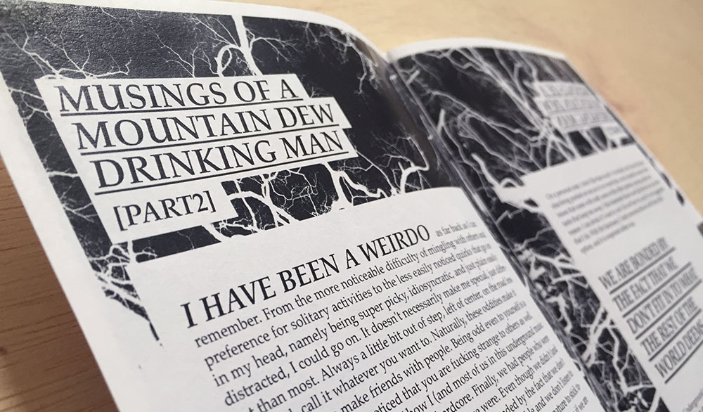
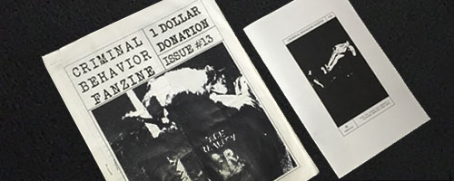
Even though the new redesign was downsized (right, above), I was able to fit more content in the half sheet design than the former full sheet design. This was achieved through tightening up blank spaces in the former copy, incorporating images with text, and strategic typography.
STEP 2
Maintain the client’s branding identity
The client stressed that the magazine’s aesthetic changes should be mostly made for legibility and efficiency. Although the zine was being redesigned, the client did not want to sacrifice the style and identity of the brand.
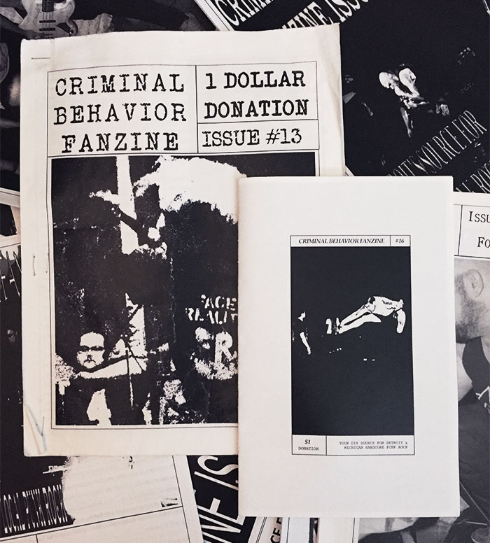
Left: The cover of the smaller redesigned zine used a very similar format to the former, larger zine. Very few changes were made to the cover approach save for typographical organization. The new cover, along with much of the rest of the zine, was simply a tightened version of the former.
