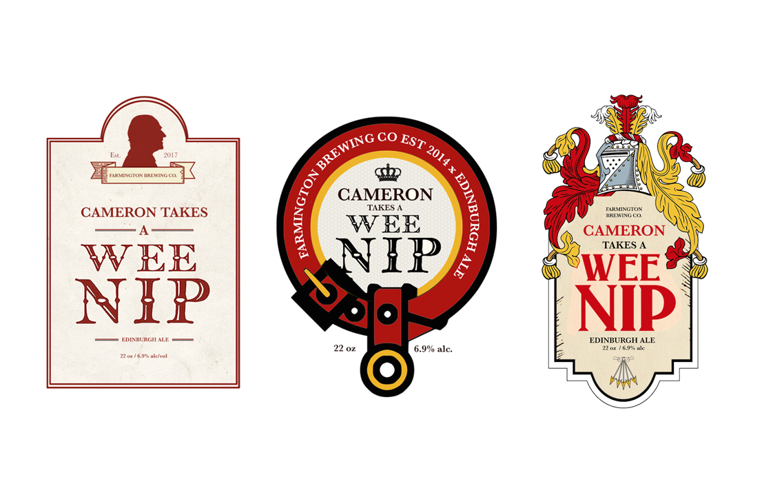
Cameron Takes a Wee Nip
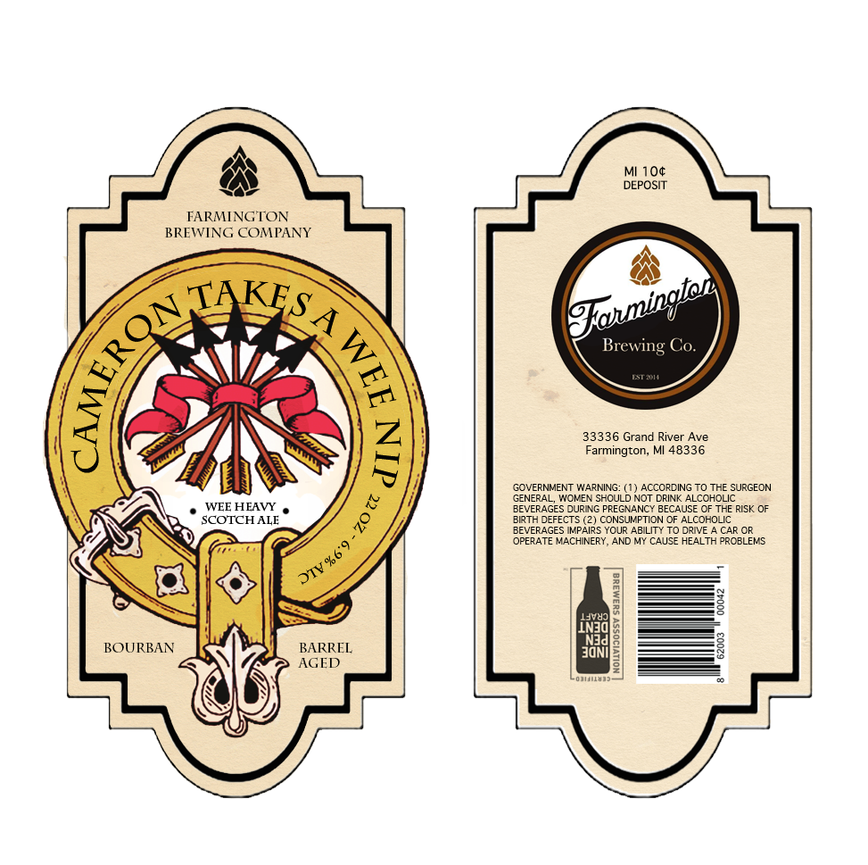
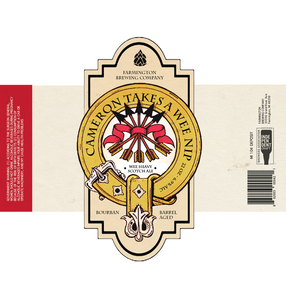
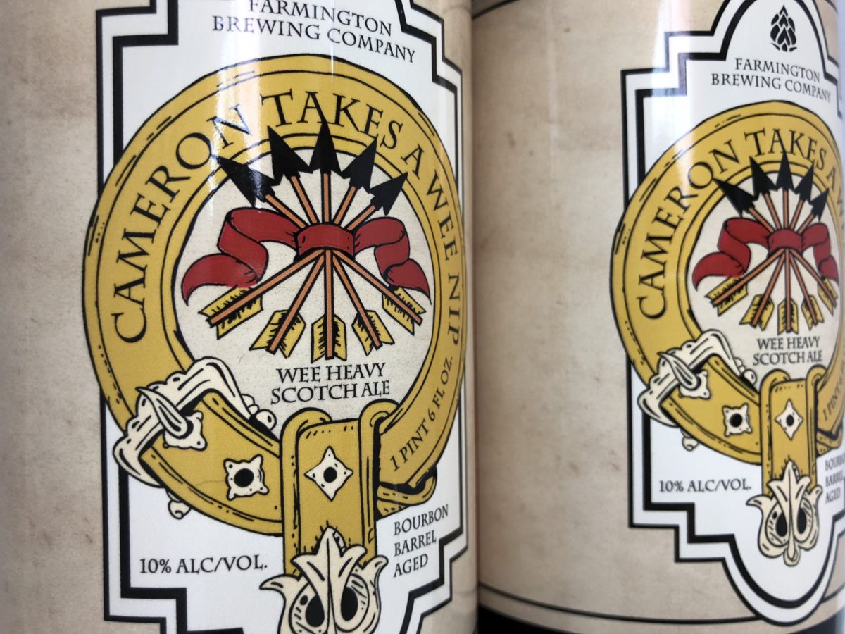
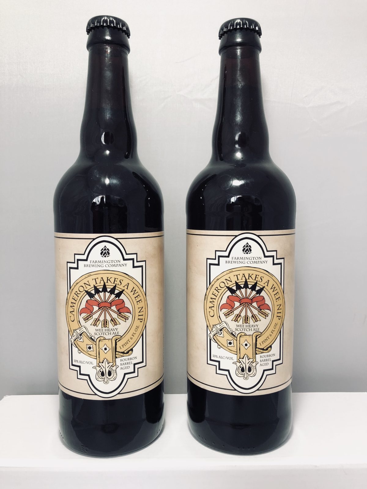
The client approached me about designing the packaging for their anniversary beer; a scotch ale called Cameron Takes a Wee Nip. The packaging had to reflect the beer’s history and background while staying true to the craft beer aesthetic.
As a scotch ale, I was asked to draw influence from sources like the Cameron coat of arms, the Scottish flag, and other labels for similar beers. Special consideration had to be made for color, typeface, and imagery.
